
Sily의 개발 블로그!
CSS 요약: 2.1 - 2.5 본문
2.1 CSS 기본 문법
CSS는 HTML의 각 요소(Element)의 style(design, layout etc)을 정의하여 브라우저에게 설명하기 위한 언어이다.
HTML는 정보와 구조화, CSS는 styling의 정의로 명확한 구분이 이루어졌다.
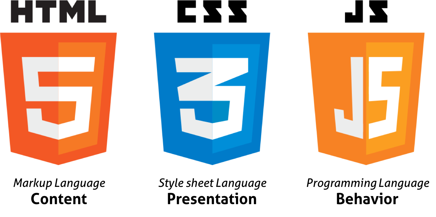
HTML과 CSS는 각자의 문법을 갖는 별개의 언어이며 HTML은 CSS를 포함할 수 있다.
1. 셀렉터 (Selector, 선택자)
CSS는 스타일을 적용하고자 하는 HTML 요소를 선택할 수 있어야 한다.

CSS Rule Set
위와 같은 구문을 Rule Set(또는 Rule)이라 하며, Rule Set의 집합을 스타일시트(Style Sheet)라 한다.
2. 프로퍼티 (Property / 속성)
여러 개의 프로퍼티를 연속해서 지정할 수 있으며 세미콜론(;)으로 구분한다.
3. 값 (Value / 속성값)
프로퍼티의 값은 해당 프로퍼티에 사용할 수 있는 값을 “키워드”나 “크기 단위” 또는 “색상 표현 단위” 등의 특정 단위로 지정하여야 한다.
4. HTML과 CSS의 연동
CSS를 가지고 있지 않은 HTML은 브라우저에서 기본으로 적용하는 CSS(user agent stylesheet)에 의해 렌더링된다.
CSS와 HTML을 연동하는 방법은 다음과 같다.
4.1 Link style
HTML에서 외부에 있는 CSS 파일을 로드하는 방식이다. 가장 일반적으로 사용된다. 3가지 중 Link style을 권장
<!DOCTYPE html>
<html>
  <head>
    <link rel="stylesheet" href="css/style.css">
  </head>
  <body>
    <h1>Hello World</h1>
    <p>This is a web page.</p>
  </body>
</html>
h1 { color: red; }
p  { background: blue; }
4.2 Embedding style
HTML 내부에 CSS를 포함시키는 방식이다.
<!DOCTYPE html>
<html>
  <head>
    <style>
      h1 { color: red; }
      p  { background: aqua; }
    </style>
  </head>
  <body>
    <h1>Hello World</h1>
    <p>This is a web page.</p>
  </body>
</html>
4.3 Inline style
HTML요소의 style 프로퍼티에 CSS를 기술하는 방식이다.
<!DOCTYPE html>
<html>
  <body>
    <h1 style="color: red">Hello World</h1>
    <p style="background: aqua">This is a web page.</p>
  </body>
</html>
5. Reset CSS 사용하기
Reset CSS는 기본적인 HTML 요소의 CSS를 초기화하는 용도로 사용한다.
다음은 Eric Meyer’s reset css이다. 이것을 기준으로 사용자의 CSS를 완성해 나가는 방법은 매우 유용하다.
/* http://meyerweb.com/eric/tools/css/reset/
  v2.0 | 20110126
  License: none (public domain)
*/

html, body, div, span, applet, object, iframe,
h1, h2, h3, h4, h5, h6, p, blockquote, pre,
a, abbr, acronym, address, big, cite, code,
del, dfn, em, img, ins, kbd, q, s, samp,
small, strike, strong, sub, sup, tt, var,
b, u, i, center,
dl, dt, dd, ol, ul, li,
fieldset, form, label, legend,
table, caption, tbody, tfoot, thead, tr, th, td,
article, aside, canvas, details, embed,
figure, figcaption, footer, header, hgroup,
menu, nav, output, ruby, section, summary,
time, mark, audio, video {
  margin: 0;
  padding: 0;
  border: 0;
  font-size: 100%;
  font: inherit;
  vertical-align: baseline;
}
/* HTML5 display-role reset for older browsers */
article, aside, details, figcaption, figure,
footer, header, hgroup, menu, nav, section {
  display: block;
}
body {
  line-height: 1;
}
ol, ul {
  list-style: none;
}
blockquote, q {
  quotes: none;
}
blockquote:before, blockquote:after,
q:before, q:after {
  content: '';
  content: none;
}
table {
  border-collapse: collapse;
  border-spacing: 0;
}
2.2 셀렉터
1. 복수개의 셀렉터: 쉼표( , )로 구분한다.
h1, p { color: red; }
1. 전체 셀렉터 (Universal Selector)
| * | HTML 문서 내의 모든 요소를 선택한다. html 요소를 포함한 모든 요소가 선택된다. (head 요소도 포함된다) |
2. 태그 셀렉터 (Type Selector)
| 태그명 | 지정된 태그명을 가지는 요소를 선택한다. |
3. ID 셀렉터 (ID Selector)
| #id 어트리뷰트 값 | id 어트리뷰트 값을 지정하여 일치하는 요소를 선택한다. id 어트리뷰트 값은 중복될 수 없는 유일한 값이다. |
4. 클래스 셀렉터 (Class Selector)
| .class 어트리뷰트 값 | class 어트리뷰트 값을 지정하여 일치하는 요소를 선택한다. class 어트리뷰트 값은 중복될 수 있다. |
HTML 요소에 class 어트리뷰트 값은 공백으로 구분하여 여러 개 지정할 수 있다.
<!DOCTYPE html>
<html>
<head>
  <style>
    /* class 어트리뷰트 값이 text-center인 모든 요소를 선택 */
    .text-center { text-align: center; }
    /* class 어트리뷰트 값이 text-large인 모든 요소를 선택 */
    .text-large  { font-size: 200%; }
    /* class 어트리뷰트 값이 text-red인 모든 요소를 선택 */
    .text-red    { color: red; }
    /* class 어트리뷰트 값이 text-blue인 모든 요소를 선택 */
    .text-blue   { color: blue; }
  </style>
</head>
<body>
  <p class="text-center">Center</p>
  <p class="text-large text-red">Large Red</p>
  <p class="text-center text-large text-blue">Center Large Blue</p>
</body>
</html>
5. 어트리뷰트 셀렉터 (Attribute Selector)
| 셀렉터[어트리뷰트] | 지정된 어트리뷰트를 갖는 모든 요소를 선택한다. |
| 셀렉터[어트리뷰트=”값”] | 지정된 어트리뷰트를 가지며 지정된 값과 어트리뷰트의 값이 일치하는 모든 요소를 선택한다. |
| 셀렉터[어트리뷰트~=”값”] | 지정된 어트리뷰트의 값이 지정된 값을 (공백으로 분리된) 단어로 포함하는 요소를 선택한다. |
| 셀렉터[어트리뷰트|=”값”] | 지정된 어트리뷰트의 값과 일치하거나 지정 어트리뷰트 값 뒤 연이은 하이픈(“값-“)으로 시작하는 요소를 선택한다. |
| 셀렉터[어트리뷰트^=”값”] | 지정된 어트리뷰트 값으로 시작하는 요소를 선택한다. |
| 셀렉터[어트리뷰트$=”값”] | 지정된 어트리뷰트 값으로 끝나는 요소를 선택한다. |
| 셀렉터[어트리뷰트*=”값”] | 지정된 어트리뷰트 값을 포함하는 요소를 선택한다. |
6. 복합 셀렉터 (Combinator)
6.1 후손 셀렉터 (Descendant Combinator)

자신의 1 level 상위에 속하는 요소를 부모 요소, 1 level 하위에 속하는 요소를 자손 요소(자식 요소)라한다.
자신보다 n level 하위에 속하는 요소는 후손 요소(하위 요소)라 한다.
후손 셀렉터는 셀렉터A의 모든 후손(하위) 요소 중 셀렉터B와 일치하는 요소를 선택한다.
셀렉터A 셀렉터B
6.2 자식 셀렉터 (Child Combinator)
자손 셀렉터는 셀렉터A의 모든 자식 요소 중 셀렉터B와 일치하는 요소를 선택한다.
셀렉터A > 셀렉터B
6.3 형제(동위) 셀렉터 (Sibling Combinator)
형제(동위) 셀렉터는 형제 관계(동위 관계)에서 뒤에 위치하는 요소를 선택할 때 사용한다.

6.3.1 인접 형제 셀렉터(Adjacent Sibling Combinator)
셀렉터A의 형제 요소 중 셀렉터A 바로 뒤에 위치하는 셀렉터B 요소를 선택한다. A와 B 사이에 다른 요소가 존재하면 선택되지 않는다.
셀렉터A + 셀렉터B
6.3.2 일반 형제 셀렉터(General Sibling Combinator)
셀렉터A의 형제 요소 중 셀렉터A 뒤에 위치하는 셀렉터B 요소를 모두 선택한다.
셀렉터A ~ 셀렉터B
7. 가상 클래스 셀렉터 (Pseudo-Class Selector)
가상 클래스는 요소의 특정 상태에 따라 스타일을 정의할 때 사용된다. 특정 상태란 예를 들어 다음과 같다.
- 마우스가 올라와 있을때
- 링크를 방문했을 때와 아직 방문하지 않았을 때
- 포커스가 들어와 있을 때
selector:pseudo-class {
  property: value;
}
7.1 링크 셀렉터(Link pseudo-classes), 동적 셀렉터(User action pseudo-classes)
| :link | 셀렉터가 방문하지 않은 링크일 때 |
| :visited | 셀렉터가 방문한 링크일 때 |
| :hover | 셀렉터에 마우스가 올라와 있을 때 |
| :active | 셀렉터가 클릭된 상태일 때 |
| :focus | 셀렉터에 포커스가 들어와 있을 때 |
<!DOCTYPE html>
<html>
<head>
  <style>
    /* a 요소가 방문하지 않은 링크일 때 */
    a:link { color: orange; }

    /* a 요소가 방문한 링크일 때 */
    a:visited { color: green; }

    /* a 요소에 마우스가 올라와 있을 때 */
    a:hover { font-weight: bold; }

    /* a 요소가 클릭된 상태일 때 */
    a:active { color: blue; }

    /* text input 요소와 password input 요소에 포커스가 들어와 있을 때 */
    input[type=text]:focus,
    input[type=password]:focus {
      color: red;
    }
    </style>
  </head>
<body>
  <a href="#" target="_blank">This is a link</a><br>
  <input type="text" value="I'll be red when focused"><br>
  <input type="password" value="I'll be red when focused">
</body>
</html>
7.2 UI 요소 상태 셀렉터(UI element states pseudo-classes)
pseudo-classDescription
| :checked | 셀렉터가 체크 상태일 때 |
| :enabled | 셀렉터가 사용 가능한 상태일 때 |
| :disabled | 셀렉터가 사용 불가능한 상태일 때 |
7.3 구조 가상 클래스 셀렉터(Structural pseudo-classes)
| :first-child | 셀렉터에 해당하는 모든 요소 중 첫번째 자식인 요소를 선택한다. |
| :last-child | 셀렉터에 해당하는 모든 요소 중 마지막 자식인 요소를 선택한다. |
| :nth-child(n) | 셀렉터에 해당하는 모든 요소 중 앞에서 n번째 자식인 요소를 선택한다. |
| :nth-last-child(n) | 셀렉터에 해당하는 모든 요소 중 뒤에서 n번째 자식인 요소를 선택한다. |
n은 0부터 시작하는 정수이다.
수열도 사용 가능
| :first-of-type | 셀렉터에 해당하는 요소의 부모 요소의 자식 요소 중 첫번째 등장하는 요소를 선택한다. |
| :last-of-type | 셀렉터에 해당하는 요소의 부모 요소의 자식 요소 중 마지막에 등장하는 요소를 선택한다. |
| :nth-of-type(n) | 셀렉터에 해당하는 요소의 부모 요소의 자식 요소 중 앞에서 n번째에 등장하는 요소를 선택한다. |
| :nth-last-of-type(n) | 셀렉터에 해당하는 요소의 부모 요소의 자식 요소 중 뒤에서 n번째에 등장하는 요소를 선택한다. |
7.4 부정 셀렉터(Negation pseudo-class)
| :not(셀렉터) | 셀렉터에 해당하지 않는 모든 요소를 선택한다. |
<!DOCTYPE html>
<html>
<head>
  <style>
    /* input 요소 중에서 type 어트리뷰트의 값이 password가 아닌 요소를 선택 */
    input:not([type=password]) {
      background: yellow;
    }
  </style>
</head>
<body>
  <input type="text" value="Text input">
  <input type="email" value="email input">
  <input type="password" value="Password input">
</body>
</html>
7.5 정합성 체크 셀렉터(validity pseudo-class)
| :valid | 정합성 검증이 성공한 input 요소 또는 form 요소를 선택한다. |
| :invalid | 정합성 검증이 실패한 input 요소 또는 form 요소를 선택한다. |
<!DOCTYPE html>
<html>
<head>
  <style>
    input[type="text"]:valid {
      background-color: greenyellow;
    }

    input[type="text"]:invalid {
      background-color: red;
    }
  </style>
</head>
<body>
  <label>입력값이 반드시 필요
    <input type="text" required>
  </label>
  <br>
  <label>특수문자를 포함하지 않는 4자리 문자 또는 숫자
    <input type="text" value="ab1!"
      pattern="[a-zA-Z0-9]{4}" required>
  </label>
  <br>
  <label>핸드폰 번호 형식
    <input type="text" value="010-1111-2222"
      pattern="^\d{3}-\d{3,4}-\d{4}$" required>
  </label>
</body>
</html>
8. 가상 요소 셀렉터 (Pseudo-Element Selector)
가상 요소는 요소의 특정 부분에 스타일을 적용하기 위하여 사용된다. 특정 부분이란 예를 들어 다음과 같다.
- 요소 콘텐츠의 첫글자 또는 첫줄
- 요소 콘텐츠의 앞 또는 뒤
가상 요소에는 두개의 콜론(::)을 사용한다. CSS 표준에 의해 미리 정의된 이름이 있기 때문에 임의의 이름을 사용할 수 없다.
selector::pseudo-element {
  property:value;
}
pseudo-elementDescription
| ::first-letter | 콘텐츠의 첫글자를 선택한다. |
| ::first-line | 콘텐츠의 첫줄을 선택한다. 블록 요소에만 적용할 수 있다. |
| ::after | 콘텐츠의 뒤에 위치하는 공간을 선택한다. 일반적으로 content 프로퍼티와 함께 사용된다. |
| ::before | 콘텐츠의 앞에 위치하는 공간을 선택한다. 일반적으로 content 프로퍼티와 함께 사용된다. |
| ::selection | 드래그한 콘텐츠를 선택한다. iOS Safari 등 일부 브라우저에서 동작 않는다. |
2.3 CSS 프로퍼티 값의 단위
1. 키워드
각 프로퍼티에 따라 사용할 수 있는 키워드가 존재한다. 예를 들어 display 프로퍼티의 값으로 사용할 수 있는 키워드는 block, inline, inline-block, none이 있다.
2. 크기 단위
CSS에서 사용하는 대표적인 크기 단위는 px, em, %이다.
px은 절대값이고 em, %는 상대값이다.
대부분 브라우저의 폰트 사이즈 기본값은 16px, 1em, 100%이다. 프로퍼티 값이 0인 경우, 단위를 생략할 수 있다.
2.1 px
px은 픽셀(화소) 단위이다. 대부분의 브라우저는 1px을 1/96 인치의 절대단위로 인식한다.
px은 요소의 크기나 이미지의 크기 지정에 주로 사용된다.
2.2 %
%는 백분률 단위의 상대 단위이다. 요소에 지정된 사이즈(상속된 사이즈나 디폴트 사이즈)에 상대적인 사이즈를 설정한다.
2.3 em
em은 배수(倍數) 단위로 상대 단위이다. 요소에 지정된 사이즈(상속된 사이즈나 디폴트 사이즈)에 상대적인 사이즈를 설정한다. 예를 들어 1em은 요소에 지정된 사이즈와 같고 2em은 요소에 지정된 사이즈의 2배이다.
폰트 사이즈 설정이나 콘텐츠를 포함하는 컨테이너의 크기 설정에 사용하면 상대적인 설정이 가능하여 편리하다.
<!DOCTYPE html>
<html>
<head>
  <style>
    body {
      font-size: 14px;
      text-align: center;
    }
    div {
      font-size: 1.2em; /* 14px * 1.2 = 16.8px */
      font-weight: bold;
      padding: 2em;     /* 16.8px * 2 = 33.6px */
      background-color: rgba(255, 0, 0, 0.2);
    }
  </style>
</head>
<body>
  <div>Font size: 1.2em → 14px * 1.2 = 16.8px</div>
</body>
</html>
중첩된 자식 요소에 em을 지정하면 모든 자식 요소의 사이즈에 영향을 미치기 때문에 주의하여야 한다.
<!DOCTYPE html>
<html>
<head>
  <style>
    body {
      font-size: 14px;
      text-align: center;
    }
    div {
      font-size: 1.2em; /* 14px * 1.2 = 16.8px */
      font-weight: bold;
      padding: 2em;
    }
    .box1 { background-color: rgba(255, 0, 0, 0.2); }
    .box2 { background-color: rgba(255, 0, 0, 0.6); }
    .box3 { background-color: rgba(255, 0, 0, 0.8); }
  </style>
</head>
<body>
  <div class='box1'>
    Font size: 1.2em ⇒ 14px * 1.2 = 16.8px
    <div class='box2'>
      Font size: 1.2em ⇒ 16.8px * 1.2 = 20.16px
      <div class='box3'>
        Font size: 1.2em ⇒ 20.16px * 1.2 = 24.192px
      </div>
    </div>
  </div>
</body>
</html>

상대 단위인 em의 기준이 상속의 영향으로 바뀔 수 있다.
2.4 rem
rem은 최상위 요소(html)의 사이즈를 기준으로 삼는다.
<!DOCTYPE html>
<html>
<head>
  <style>
    html {
      font-size: 14px;
      /* font-size 미지정 시에는 16px */
    }
    div {
      font-size: 1.2rem; /* html font-size: 14px * 1.2 = 16.8px */
      font-weight: bold;
      padding: 2em;
      text-align: center;
    }
    .box1 { background-color: rgba(255, 0, 0, 0.2); }
    .box2 { background-color: rgba(255, 0, 0, 0.6); }
    .box3 { background-color: rgba(255, 0, 0, 0.8); }
  </style>
</head>
<body>
  <div class='box1'>
    Font size: 1.2rem ⇒ 14px * 1.2 = 16.8px
    <div class='box2'>
      Font size: 1.2rem ⇒ 14px * 1.2 = 16.8px
      <div class='box3'>
        Font size: 1.2rem ⇒ 14px * 1.2 = 16.8px
      </div>
    </div>
  </div>
</body>
</html>

사용자가 브라우저의 기본 폰트 크기를 변경(Mac Chrome의 경우, 설정 > 고급 설정 표시 > 웹 콘텐츠 > 글꼴 맞춤 설정)하더라도 이에 따라 웹사이트의 레이아웃을 적절히 조정할 수 있다는 장점이 있다. 따라서 폰트 사이즈 뿐만이 아니라 콘텐츠의 크기에 따라 가변적으로 대응하여야 하는 wrapper 요소(container) 등에 적합하다.
.container {
  width: 70rem; /* 70rem ⇒ 14px * 70 = 980px */
}
Reset CSS를 사용하여 사전에 html 요소의 font-size 지정이 필요하다. font-size 미지정 시에는 16px가 적용된다.
2.5 Viewport 단위(vh, vw, vmin, vmax)
% 단위는 em과 같이 상속에 의해 부모 요소에 상대적 영향을 받는다.
반응형 웹디자인은 화면의 크기에 동적으로 대응하기 위해 % 단위를 자주 사용한다.
Viewport 단위는 상대적인 단위로 viewport를 기준으로 한 상대적 사이즈를 의미한다.
| vw | viewport 너비의 1/100 |
| vh | viewport 높이의 1/100 |
| vmin | viewport 너비 또는 높이 중 작은 쪽의 1/100 |
| vmax | viewport 너비 또는 높이 중 큰 쪽의 1/100 |
예를 들어 viewport 너비가 1000px, 높이가 600px인 경우,
- 1vw : viewport 너비 1000px의 1%인 10px
- 1vh : viewport 높이 600px의 1%인 6px
- vmin : viewport 높이 600px의 1%인 6px
- vmax : viewport 너비 1000px의 1%인 10px
3. 색상 표현 단위
색상을 지정하기 위해 키워드(red, blue…)를 사용할 수 있다. 사용이 간편하다는 장점이 있으나 표현할 수 있는 색상의 수는 제한된다.
색상를 표현할 수 있는 키워드 리스트는 W3C css3-color를 참고하기 바란다.
더욱 다양한 색상을 표현하기 위해 다음과 같은 색상 표현 단위를 사용할 수 있다. HTML COLOR CODES를 참조하면 편리하다.
| HEX 코드 단위 (Hexadecimal Colors) | #000000 |
| RGB (Red, Green, Blue) | rgb(255, 255, 0) |
| RGBA (Red, Green, Blue, Alpha/투명도) | rgba(255, 255, 0, 1) |
| HSL (Hue/색상, Saturation/채도, Lightness/명도) | hsl(0, 100%, 25%) |
| HSLA (Hue, Saturation, Lightness, Alpha) | hsla(60, 100%, 50%, 1) |
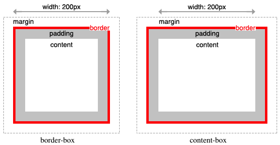
2.4 박스 모델
모든 HTML 요소는 Box 형태의 영역을 가지고 있다.
Box는 콘텐트(Content), 패딩(Padding), 테두리(Border), 마진(Margin)로 구성된다.

Box 모델을 구성하는 콘텐트(Content), 패딩(Padding), 테두리(Border), 마진(Margin)에 대한 설명은 아래와 같다.
| Content | 요소의 텍스트나 이미지 등의 실제 내용이 위치하는 영역이다. width, height 프로퍼티를 갖는다. |
| Padding | 테두리(Border) 안쪽에 위치하는 요소의 내부 여백 영역이다. padding 프로퍼티 값은 패딩 영역의 두께를 의미하며 기본색은 투명(transparent)이다. 요소에 적용된 배경의 컬러, 이미지는 패딩 영역까지 적용된다. |
| Border | 테두리 영역으로 border 프로퍼티 값은 테두리의 두께를 의미한다. |
| Margin | 테두리(Border) 바깥에 위치하는 요소의 외부 여백 영역이다. margin 프로퍼티 값은 마진 영역의 두께를 의미한다. 기본적으로 투명(transparent)하며 배경색을 지정할 수 없다. |
<!DOCTYPE html>
<html>
<head>
  <style>
    div {
      /* 배경색의 지정: 콘텐츠 영역과 패딩 영역에 적용된다. */
      background-color: lightgrey;
      /* 콘텐츠 영역의 너비 */
      width: 300px;
      /* 패딩 영역의 두께 */
      padding: 25px;
      /* 테두리: 두께 형태 색상 */
      border: 25px solid navy;
      /* 마진 영역의 두께 */
      margin: 25px;
    }
  </style>
</head>
<body>
  <h2>Box Model</h2>

  <div>Lorem ipsum dolor sit amet, consectetur adipiscing elit, sed do eiusmod tempor incididunt ut labore et dolore magna aliqua. Ut enim ad minim veniam, quis nostrud exercitation ullamco laboris nisi ut aliquip ex ea commodo consequat. Duis aute irure dolor in reprehenderit in voluptate velit esse cillum dolore eu fugiat nulla pariatur. Excepteur sint occaecat cupidatat non proident, sunt in culpa qui officia deserunt mollit anim id est laborum.</div>
</body>
</html>

Chrome DevTools에서 확인한 Box-model
1. width / height 프로퍼티
width와 height 프로퍼티는 요소의 너비와 높이를 지정하기 위해 사용되며, 컨텐츠 영역을 대상으로 한다.
이는 box-sizing 프로퍼티에 기본값인 content-box가 적용되었기 때문이다. box-sizing 프로퍼티에 border-box를 적용하면 콘텐츠 영역, padding, border가 포함된 영역을 width / height 프로퍼티의 대상으로 지정할 수 있다.
만일 width와 height로 지정한 콘텐츠 영역보다 실제 콘텐츠가 크면 콘텐츠 영역을 넘치게 된다는 것에 유의하여야 한다.
overflow: hidden;을 지정하면 넘친 콘텐츠를 감출 수 있다.
기본적으로 width와 height 프로퍼티는 콘텐츠 영역을 대상으로 요소의 너비와 높이를 지정하므로 박스 전체 크기는 다음과 같이 계산할 수 있다.
width와 height 프로퍼티의 초기값은 auto로써 이것은 브라우저가 상황에 따라 적당한 width와 height 값을 계산할 것을 의미한다.
예를 들어 block 요소의 경우, width는 부모 요소의 100%, height는 콘텐츠의 높이(+ 약간의 여분)가 지정된다.
명시적으로 width와 height를 지정하기 위해서는 px, % 등의 크기 단위를 사용한다.
width와 height 프로퍼티를 비롯한 모든 박스모델 관련 프로퍼티(margin, padding, border, box-sizing 등)는 상속되지 않는다.
2. margin / padding 프로퍼티
margin / padding 프로퍼티는 content의 4개 방향(top, right, left, bottom)에 대하여 지정이 가능하다.

-top, -right, -bottom, -left 4방향의 프로퍼티를 각각 지정하지 않고 margin, padding 1개의 프로퍼티만으로 4방향의 프로퍼티를 한번에 지정할 수 있다.
4개의 값을 지정할 때
margin: 25px 50px 75px 100px;
- margin-top: 25px;
- margin-right: 50px;
- margin-bottom: 75px;
- margin-left: 100px;
3개의 값을 지정할 때
margin: 25px 50px 75px;
- margin-top: 25px;
- margin-right: 50px; margin-left: 50px;
- margin-bottom: 75px
2개의 값을 지정할 때
margin: 25px 50px;
- margin-top: 25px; margin-bottom: 25px;
- margin-right: 50px; margin-left: 50px;
1개의 값을 지정할 때
margin: 25px;
- margin-top: 25px; margin-right: 25px; margin-bottom: 25px; margin-left: 25px;
margin 프로퍼티에 auto 키워드를 설정하면 해당 요소를 브라우저 중앙에 위치 시킬 수 있다.
보다 자세한 중앙 정렬 방법에 대해서는 Horizontal & Vertical Centering을 참조하기 바란다.
요소 너비가 브라우저 너비보다 크면 가로 스크롤바가 만들어진다. 이 문제를 해결하기 위해서 max-width 프로퍼티를 사용할 수 있다.
max-width 프로퍼티를 사용하면 브라우저 너비가 요소의 너비보다 좁아질 때 자동으로 요소의 너비가 줄어든다.
max-width 프로퍼티는 요소 너비의 최대값을, min-width 프로퍼티는 요소 너비의 최소값을 지정한다. 예를 들어 max-width: 300px;의 경우, 브라우저의 너비가 300px보다 작아지면 요소 너비는 브라우저의 너비에 따라서 작아진다. min-width: 300px;의 경우 브라우저의 너비가 300px보다 작아져도 요소 너비는 지정 너비(300px)을 유지한다.
3. border 프로퍼티
3.1 border-style
border-style 프로퍼티는 테두리 선의 스타일을 지정한다.
border-style: dotted;
border-style: dashed;
border-style: solid;
border-style: double;
border-style: groove;
border-style: ridge;
border-style: inset;
border-style: outset;
border-style: none;
border-style: hidden;
border-style: dotted dashed solid double;
프로퍼티 값의 갯수에 따라 4개 방향(top, right, left, bottom)에 대하여 지정이 가능하다.
<!DOCTYPE html>
<html>
<head>
  <style>
    p {
      background: palegreen;
      padding: 10px;
    }
    p.d1 {
      /* four sides */
      border-style: dashed;
    }
    p.d2 {
      /* horizontal | vertical */
      border-style: dotted solid;
    }
    p.d3 {
      /* top | horizontal | bottom */
      border-style: hidden double dashed;
    }
    p.d4 {
      /* top | right | bottom | left */
      border-style: none solid dotted dashed;
    }
  </style>
</head>
<body>
  <p class="d1">border-style: dashed;</p>
  <p class="d2">border-style: dotted solid;</p>
  <p class="d3">border-style: hidden double dashed;</p>
  <p class="d4">border-style: none solid dotted dashed;</p>
  </body>
</html>
3.2 border-width
border-width 프로퍼티는 테두리의 두께를 지정한다. 프로퍼티 값의 갯수에 따라 4개 방향(top, right, left, bottom)에 대하여 지정이 가능하다.
border-width 프로퍼티는 border-style과 함께 사용하지 않으면 적용되지 않는다.
<!DOCTYPE html>
<html>
  <head>
    <style>
      p {
        background: palegreen;
        padding: 10px;
        border-style: solid
      }
      p.one {
        border-width: thin; /* 1px */
      }
      p.two {
        border-width: medium; /* 3px */
      }
      p.three {
        border-width: thick; /* 5px */
      }
      p.four {
        border-width: 15px;
      }
      p.five {
        border-width: 2px 10px 4px 20px;
      }
    </style>
  </head>
  <body>
    <h2>border-width Property</h2>

    <p>initial: 3px</p>
    <p class="one">thin: 1px</p>
    <p class="two">medium: 3px</p>
    <p class="three">thick: 5px</p>
    <p class="four">15px</p>
    <p class="five">2px 10px 4px 20px</p>
  </body>
</html>
3.3 border-color
border-color 프로퍼티는 테두리의 색상을 지정한다. 프로퍼티 값의 갯수에 따라 4개 방향(top, right, left, bottom)에 대하여 지정이 가능하다.
border-color 프로퍼티는 border-style과 함께 사용하지 않으면 적용되지 않는다.
<!DOCTYPE html>
<html>
  <head>
    <style>
      p {
        background: palegreen;
        padding: 10px;
        border-style: solid;
      }
      p.one {
        border-color: red;
      }
      p.two {
        border-color: green;
      }
      p.three {
        border-color: red green blue yellow;
      }

    </style>
  </head>
  <body>
    <h2>border-color Property</h2>

    <p class="one">border-color: red</p>
    <p class="two">border-color: green</p>
    <p class="three">border-color: red green blue yellow</p>
  </body>
</html>
3.4 border-radius
border-radius 프로퍼티는 테두리 모서리를 둥글게 표현하도록 지정한다. 프로퍼티 값은 길이를 나타내는 단위(px, em 등)와 %를 사용한다. 각각의 모서리에 border-radius 프로퍼티를 개별적으로 지정할 수도 있고 4개의 모서리를 short-hand로 한번에 지정할 수도 있다.

하나 혹은 두개의 반지름을 설정하여 각각의 모서리 굴곡을 설정할 수 있기 때문에 원 혹은 타원의 모양으로 정의가 가능하다.

<!DOCTYPE html>
<html>
  <head>
    <style>
      div {
        background: #eaeaed;
        color: #666;
        display: inline-block;
        width: 90px;
        height: 90px;
        line-height: 90px;
        margin: 0 14px;
        text-align: center;
      }

      .border-rounded {
        /* 4 꼭지점에 대해 Radius 지정 */
        border-radius: 5px;
      }
      .border-circle {
        border-radius: 50%;
      }
      .border-football {
        /* top-left & bottom-right | top-right & bottom-left */
        border-radius: 15px 75px;
      }
    </style>
  </head>
  <body>
    <div class="border-rounded">5px</div>
    <div class="border-circle">50%</div>
    <div class="border-football">15px 75px</div>
  </body>
</html>
모든 모서리에 동일한 둥근 모서리 설정
.border-rounded {
  border-radius: 20px;

  /* 위 코드는 아래의 shorthand이다.
  border-top-left-radius:     20px;
  border-top-right-radius:    20px;
  border-bottom-right-radius: 20px;
  border-bottom-left-radius:  20px;
  */
}

<!DOCTYPE html>
<html>
<head>
  <style>
    div {
      background: #eaeaed;
      color: #666;
      width: 150px;
      height: 150px;
      line-height: 150px;
      text-align: center;
    }
    .border-rounded {
      /* 모든 모서리를 동일하게 설정 */
      border-radius: 20px;
    }
  </style>
</head>
<body>
  <div class="border-rounded">border-radius: 20px</div>
</body>
</html>
각각의 모서리를 개별적으로 설정
.border-rounded {
  border-radius: 10px 40px 40px 10px;

  /* 위 코드는 아래의 shorthand이다.
  border-top-left-radius:     10px;
  border-top-right-radius:    40px;
  border-bottom-right-radius: 40px;
  border-bottom-left-radius:  10px;
  */
}

<!DOCTYPE html>
<html>
<head>
  <style>
    div {
      background: #eaeaed;
      color: #666;
      width: 200px;
      height: 150px;
      line-height: 150px;
      text-align: center;
    }
    .border-rounded {
      /* 각각의 모서리를 개별적으로 설정 */
      border-radius: 10px 40px 40px 10px;
    }
  </style>
</head>
<body>
  <div class="border-rounded">10px 40px 40px 10px</div>
</body>
</html>
두개의 반지름을 지정하여 타원형 둥근 모서리 설정
.border-rounded {
  border-top-left-radius: 50px 25px;
}

<!DOCTYPE html>
<html>
<head>
  <style>
    div {
      background: #eaeaed;
      color: #666;
      width: 300px;
      height: 150px;
      line-height: 150px;
      text-align: center;
    }
    .border-rounded {
      border-top-left-radius: 50px 25px;
    }
  </style>
</head>
<body>
  <div class="border-rounded">border-top-left-radius: 50px 25px</div>
</body>
</html>
각각의 모서리에 타원형 둥근 모서리 축약 설정
.border-rounded {
  border-radius: 50px 50px 0 0 / 25px 25px 0 0;
}

<!DOCTYPE html>
<html>
<head>
  <style>
    div {
      background: #eaeaed;
      color: #666;
      width: 450px;
      height: 150px;
      padding: 10px;
    }
    .border-rounded {
      border-radius: 10px 20px 30px 40px / 5px 10px 15px 20px;
    }
  </style>
</head>
<body>
  <div class="border-rounded">
    border-radius: 10px 20px 30px 40px / 5px 10px 15px 20px;
    <ul>
      <li>border-top-left-radius: 10px 5px;</li>
      <li>border-top-right-radius: 20px 10px;</li>
      <li>border-bottom-right-radius: 30px 15px;</li>
      <li>border-bottom-left-radius: 40px 20px;</li>
    </ul>
  </div>
</body>
</html>
3.5 border
border 프로퍼티는 border-width, border-style, border-color를 한번에 설정하기 위한 shorthand 프로퍼티이다.
/* Syntax */
border: border-width border-style border-color;
p {
  /* border-width border-style border-color */
  border: 5px solid red;
}
4. box-sizing 프로퍼티
box-sizing 프로퍼티는 width, height 프로퍼티의 대상 영역을 변경할 수 있다.
| content-box | width, height 프로퍼티 값은 content 영역을 의미한다. (기본값) |
| border-box | width, height 프로퍼티 값은 content 영역, padding, border가 포함된 값을 의미한다. |
box-sizing 프로퍼티는 상속되지 않는다. 따라서 box-sizing 프로퍼티를 사용하도록 초기화하려면 아래와 같이 정의한다.
html {
  box-sizing: border-box;
}
*, *:before, *:after {
  box-sizing: inherit;
}
2.5 display, visibility, opacity 프로퍼티
1. display 프로퍼티
display 프로퍼티는 layout 정의에 자주 사용되는 중요한 프로퍼티이다.
| block | block 특성을 가지는 요소(block 레벨 요소)로 지정 |
| inline | inline 특성을 가지는 요소(inline 레벨 요소)로 지정 |
| inline-block | inline-block 특성을 가지는 요소(inline-block 레벨 요소)로 지정 |
| none | 해당 요소를 화면에 표시하지 않는다 (공간조차 사라진다) |
모든 HTML 요소는 아무런 CSS를 적용하지 않아도 기본적으로 브라우저에 표현되는 디폴트 표시값을 가진다. HTML 요소는 block 또는 inline 특성을 갖는다.
아래는 p 요소에 대한 크롬 브라우저의 디폴트 css이다.
p {
  display: block;
  -webkit-margin-before: 1em;
  -webkit-margin-after: 1em;
  -webkit-margin-start: 0px;
  -webkit-margin-end: 0px;
}
display 프로퍼티는 상속되지 않는다.
1.1 block 레벨 요소
block 특성을 가지는 요소(block 레벨 요소 또는 block 요소)는 아래와 같은 특징을 갖는다.
- 항상 새로운 라인에서 시작한다.
- 화면 크기 전체의 가로폭을 차지한다. (width: 100%)
- width, height, margin, padding 프로퍼티 지정이 가능하다.
- block 레벨 요소 내에 inline 레벨 요소를 포함할 수 있다
- block 레벨 요소 예
- div
- h1 ~ h6
- p
- ol
- ul
- li
- hr
- table
- form
1.2 inline 레벨 요소
inline 특성을 가지는 요소(inline 레벨 요소 또는 inline 요소)는 아래와 같은 특징을 갖는다.
- 새로운 라인에서 시작하지 않으며 문장의 중간에 들어갈 수 있다.
- content의 너비만큼 가로폭을 차지한다.
- width, height, margin-top, margin-bottom 프로퍼티를 지정할 수 없다. 상, 하 여백은 line-height로 지정한다.
- inline 레벨 요소 뒤에 공백(엔터, 스페이스 등)이 있는 경우, 정의하지 않은 space(4px)가 자동 지정된다.
- inline 레벨 요소 내에 block 레벨 요소를 포함할 수 없다.
- inline 레벨 요소 예
- span
- a
- strong
- img
- br
- input
- select
- textarea
- button
<!DOCTYPE html>
<html>
<head>
  <style>
    span {
      background-color: red;
      color: white;
      padding: 10px;
      /* width, height, margin-top, margin-bottom 프로퍼티를 지정할 수 없다. */
      /* width: 200px; */
      /* margin: 10px; */
      /* 상, 하 여백은 line-height로 지정한다. */
      /* line-height: 50px; */
    }
  </style>
</head>
<body>
  <h1>My <span>Important</span> Heading</h1>
  <span>Inline</span>
  <span>Inline</span><span>Inline</span>
</body>
</html>
1.3 inline-block 레벨 요소
block과 inline 레벨 요소의 특징을 모두 갖는다. inline 레벨 요소와 같이 한 줄에 표현되면서 width, height, margin 프로퍼티를 모두 지정할 수 있다.
- 기본적으로 inline 레벨 요소와 흡사하게 줄을 바꾸지 않고 다른 요소와 함께 한 행에 위치시킬 수 있다.
- block 레벨 요소처럼 width, height, margin, padding 프로퍼티를 모두 정의할 수 있다. 상, 하 여백을 margin과 line-height 두가지 프로퍼티 모두를 통해 제어할 수 있다.
- content의 너비만큼 가로폭을 차지한다.
- inline-block 레벨 요소 뒤에 공백(엔터, 스페이스 등)이 있는 경우, 정의하지 않은 space(4px)가 자동 지정된다. 이것을 회피 방법은 Fighting the Space Between Inline Block Elements를 참조하기 바란다.
<!DOCTYPE html>
<html>
<head>
  <style>
    .wrapper {
      font-size: 0; /*요소간 간격을 제거*/
    }
    .inline-block {
      display: inline-block;
      vertical-align: middle; /* inline-block 요소 수직 정렬 */
      border: 3px solid #73AD21;
      font-size: 16px;
    }
    .box1 {
      width: 300px;
      height: 70px;
    }
    .box2 {
      width: 300px;
      height: 150px;
    }
  </style>
</head>
<body>
  <div class="inline-block box1">inline-block height 70px</div>
  <div class="inline-block box2">inline-block height 150px</div>

  <div class="wrapper">
    <div class="inline-block box1">inline-block height 70px</div>
    <div class="inline-block box2">inline-block height 150px</div>
  </div>
</body>
</html>
2. visibility 프로퍼티
visibility 프로퍼티는 요소를 보이게 할 것인지 보이지 않게 할 것인지를 정의한다. 즉, 요소의 렌더링 여부를 결정한다.
프로퍼티값 키워드설명
| visible | 해당 요소를 보이게 한다 (기본값) |
| hidden | 해당 요소를 보이지 않게 한다. display: none;은 해당 요소의 공간까지 사라지게 하지만 visibility: hidden;은 해당 요소의 공간은 사라지지 않고 남아있게 된다. |
| collapse | table 요소에 사용하며 행이나 열을 보이지 않게 한다. |
| none | table 요소의 row나 column을 보이지 않게 한다. IE, 파이어폭스에서만 동작하며 크롬에서는 hidden과 동일하게 동작한다. |
3. opacity 프로퍼티
opacity 프로퍼티는 요소의 투명도를 정의한다. 0.0 ~ 1.0의 값을 입력하며 0.0은 투명, 1.0은 불투명을 의미한다.
<!DOCTYPE html>
<html>
<head>
  <style>
    div, img {
      float: left;
      width: 150px;
      height: 150px;
      margin: 30px;
      background-color: blue;
      color: white;
      opacity: 0.5;
      transition: opacity 1s;
    }
    div:hover, img:hover {
      opacity: 1.0;
    }
  </style>
</head>
<body>
  <div>opacity: 0.5</div>
  <img src="https://poiemaweb.com/img/doug.jpg" alt="doug">
</body>
</html>
https://poiemaweb.com/css3-display